Research
As with the beginning of any project, I needed the full scope of what the client is looking for. PSS had another long-term client named ISD, which is a computer repair and IT services shop located on the busiest street in Oneonta, NY. They had recently decided to renew their window decals to attract more people driving by and to replace the worn-out decals from a few years prior. I learned a few key points from asking my boss a few questions:
~The window decal size will be the same as their previous design.
~This window decal is to be seen while driving or walking by, and to bring more attention to new customers.
~ISD also requested that we incorporate a new color to the mix by adding yellow.
Some of the information was given to us by the simple fact that PSS designed and installed their window decals years ago. This meant that I had a starting point to work with by having measurements accurate.
Design
Having the older design files to reference and work from, I created a new file to add the previous final design onto the page. From there I did some research on computer repair shops and more on IT companies to get an understanding of related images I could use. I saw the image of fiber optics cables and thought it was interesting, especially at a larger scale. I changed the colors and the rotation of them to give the eye a visual movement with one line going across multiple window panels. At first, it was tricky to add the yellow color because in some areas the text was harder to read from less contrast. However, due to the size of the prints the text is still readable.
Having the older design files to reference and work from, I created a new file to add the previous final design onto the page. From there I did some research on computer repair shops and more on IT companies to get an understanding of related images I could use. I saw the image of fiber optics cables and thought it was interesting, especially at a larger scale. I changed the colors and the rotation of them to give the eye a visual movement with one line going across multiple window panels. At first, it was tricky to add the yellow color because in some areas the text was harder to read from less contrast. However, due to the size of the prints the text is still readable.

Installation and Finishing Production
Once I sent the mockup and pricing to ISD and got the approval, I began to print. These panels were printed on a "view through" vinyl which means 50% visibility of both vinyl and seeing through the vinyl's tiny holes. This is perfect for windows. After the prints were complete, I took them to the large-scale lamination machine and used a glossy laminate. The laminate helps protect from weather especially the UV rays of the sun to make the product last longer. I chose glossy over matte because it is easier to see through.
Once I sent the mockup and pricing to ISD and got the approval, I began to print. These panels were printed on a "view through" vinyl which means 50% visibility of both vinyl and seeing through the vinyl's tiny holes. This is perfect for windows. After the prints were complete, I took them to the large-scale lamination machine and used a glossy laminate. The laminate helps protect from weather especially the UV rays of the sun to make the product last longer. I chose glossy over matte because it is easier to see through.
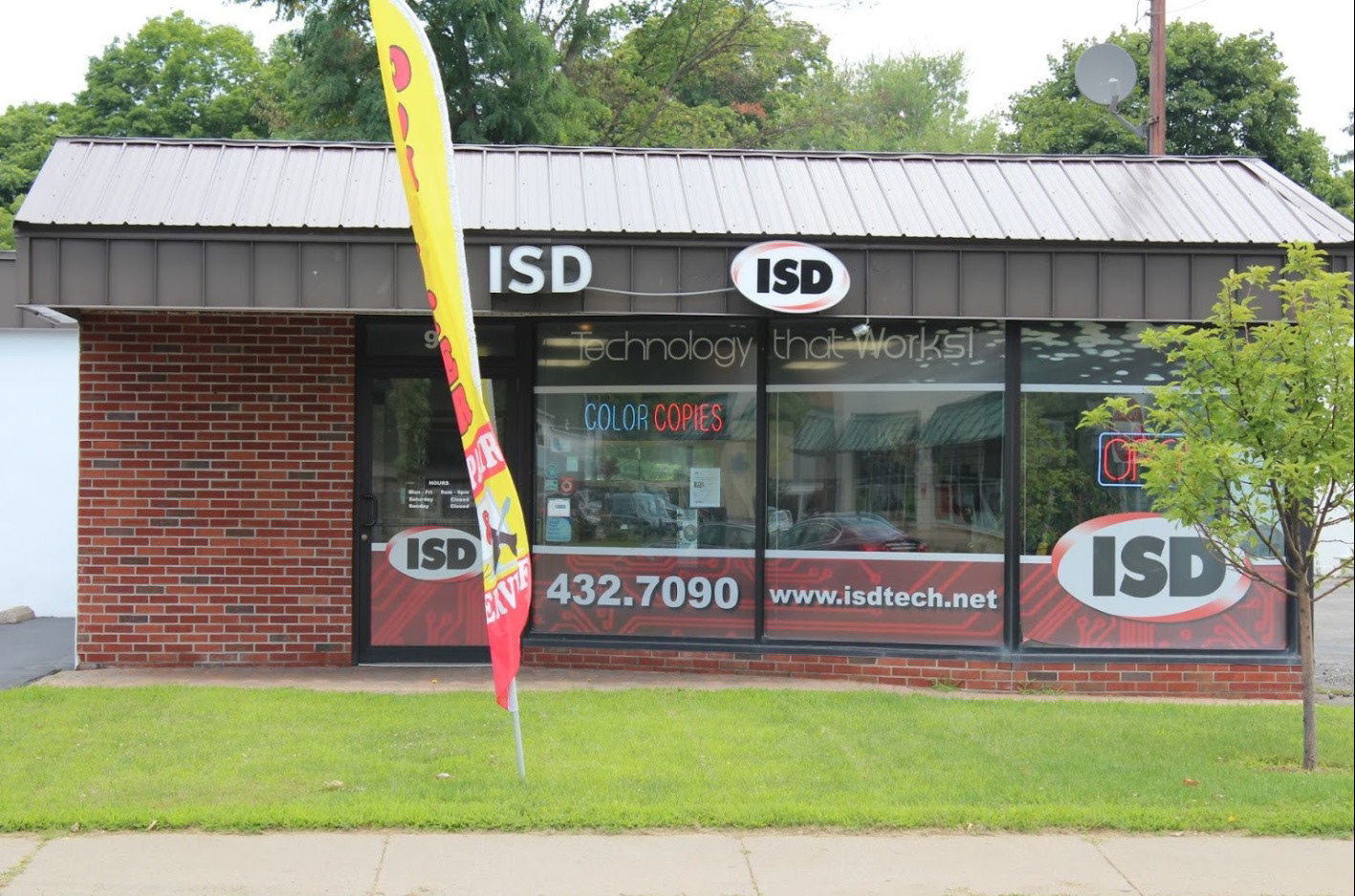
Before
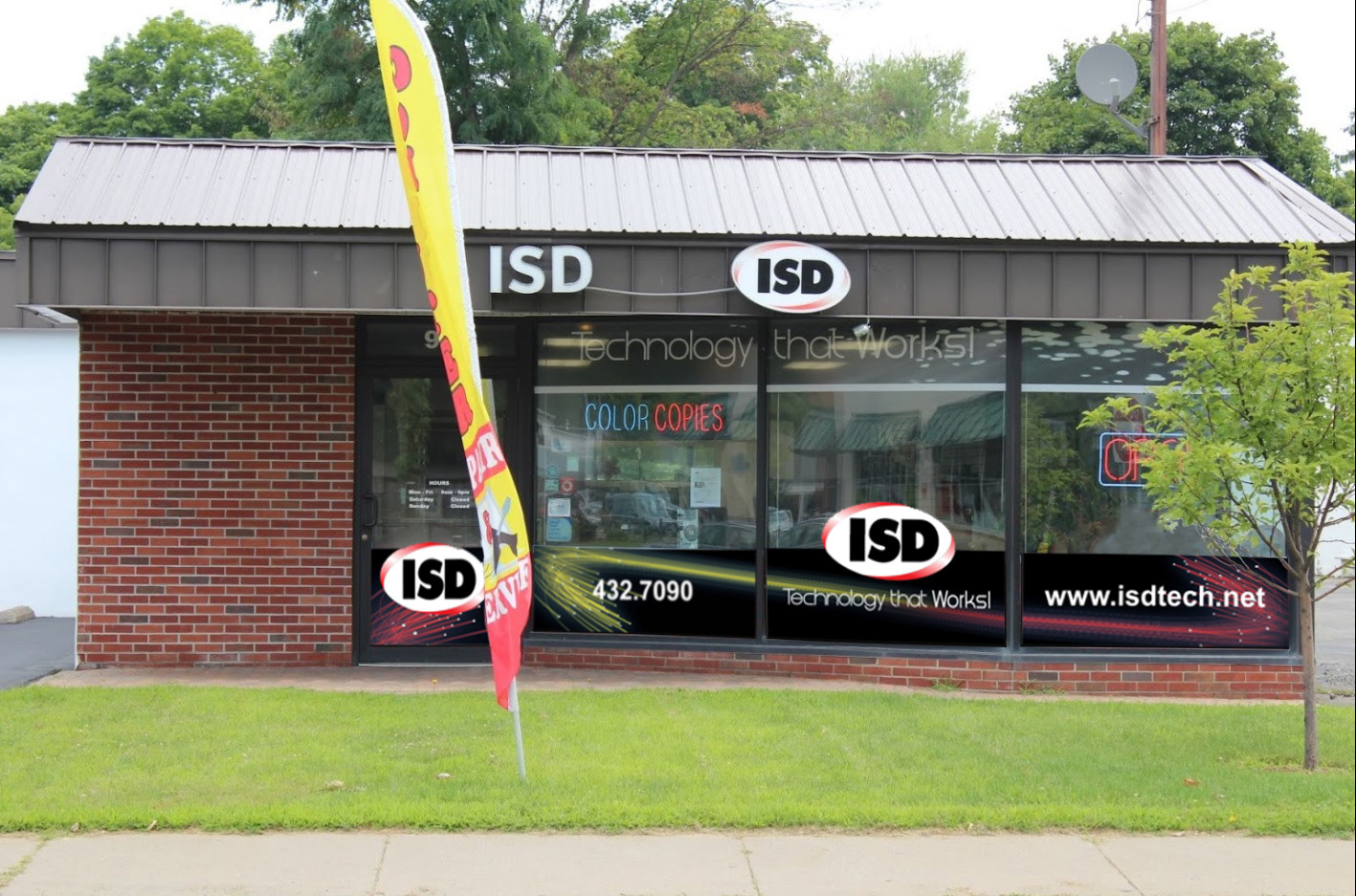
After
Reflection
I felt happy to be part of such a big project and client. I truly learned something different with every project I accomplished. I was happy to know that the client told us how they liked the use of the color yellow, knowing that was a bit of a new addition to their brand. This was certainly one of the higher-priced projects I was a part of during my time at PSS.
I felt happy to be part of such a big project and client. I truly learned something different with every project I accomplished. I was happy to know that the client told us how they liked the use of the color yellow, knowing that was a bit of a new addition to their brand. This was certainly one of the higher-priced projects I was a part of during my time at PSS.